
Maple
Powerful math software that is easy to use
• Maple for Academic • Maple for Students • Maple Learn • Maple Calculator App • Maple for Industry and Government • Maple Flow • Maple for Individuals


Communicating technical concepts through visualization is an art form. While traditional artists might use charcoal and paper, scientists and engineers use software to create plots, diagrams, graphs, and more. It may seem obvious, but if you're visualizing concepts that are influenced by math, you need software that does both math and visualization. Maple weaves together tools for math, coding and visual artistry, and helps you easily sculpt engaging visualizations. This, ultimately, will compel your audience to explore, listen and be inquisitive about your data. This whitepaper will describe how Maple allows you to create meaningful and captivating visualizations for science and engineering.
Products
Next Steps
Maple provides a wide variety of visualization tools for two- and three-dimensional plotting, animations and parameterized plots, including specialized plots for scientific and engineering applications. The interactive plot builder provides an easy to use interface for creating and customizing plots. Plots can be created quickly with options such as variable ranges, color and tick mark spacing, and graphs can be manipulated and customized using context sensitive menus. Text, math and graphical annotations can be added to further illustrate the solution.
Maple offers an interactive worksheet interface with inline plots. Typing a plot command and pressing Enter (as shown in Figure 1) will show the plot immediately below the command.
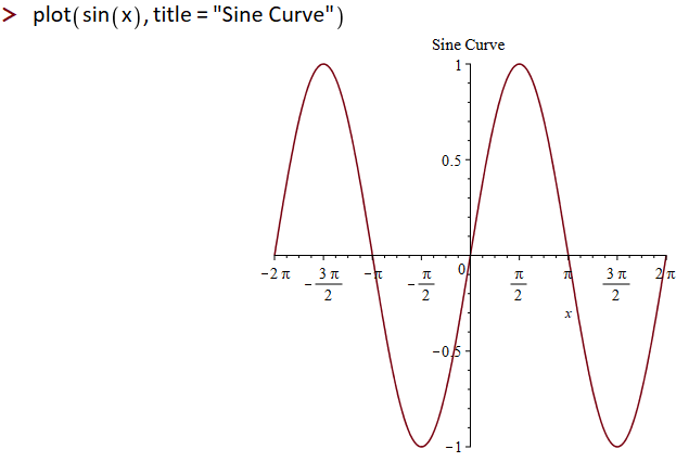
Figure 1: Plots generated inline with commands
The plot can be visually crafted with parameters added to the original command (for example, the plot in Figure 1 uses the "title" option to add a title). This design helps you quickly make changes to the look-and-feel of a plot and customize with the necessary features. Visual changes can also be made through the interactive Context Panel, as seen in Figure 2.
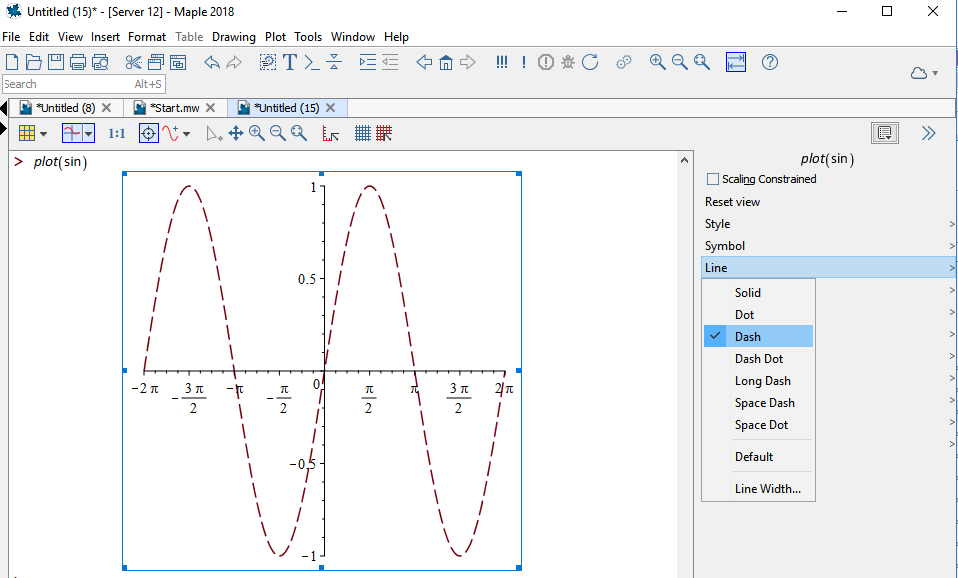
Figure 2: Customize Plots with the Context Panel
Maple has many built-in plots and charts that are fully customizable to suit your needs. For example, Figure 3 demonstrates two plots of historical sunspot data:
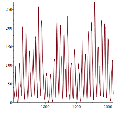
Default plot
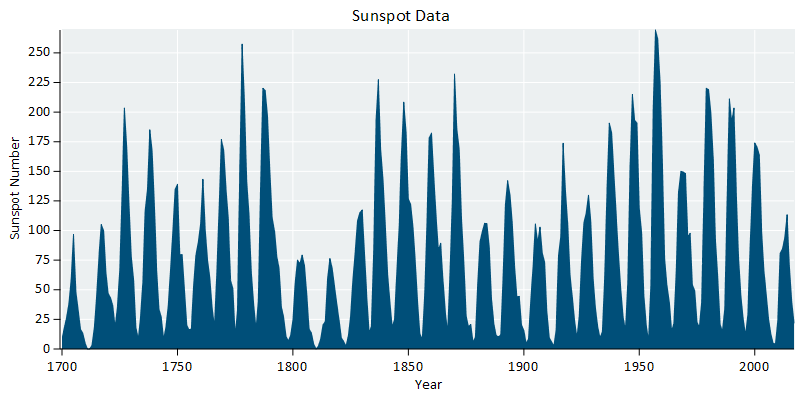
Customized plot
Figure 3: Customizing a Plot of Historical Sunspot Numbers
For advanced applications, Maple provides a large collection of commands for plot creation and customization. You can even use these commands with the exploration assistant which creates applications to explore parameters in mathematical expressions
In addition to the built-in color palettes, you can define custom colors using a variety of schemes; these include RGB, CMYK, LUV and more. For example, Figure 4 shows a ternary plot with the measured color of gold-silver-copper alloys; the data were specified in the LUV color space.
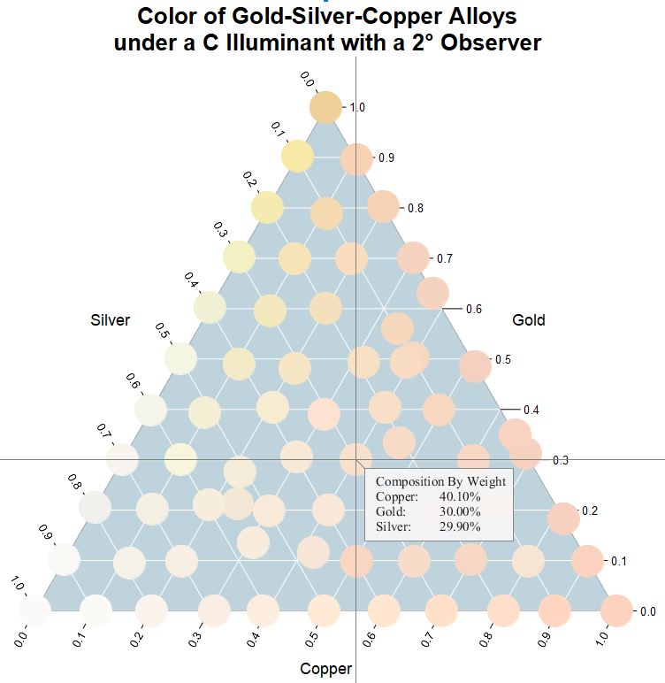
Figure 4: Color of Au-Ag-Cu Alloys
Maple has many visual primitives, such as rectangles, disks, polygons, tori and more. These basic elements can be precisely positioned, sized, assembled, and colored to construct complex visualizations. Figure 5 shows design annual weather conditions for Waterloo, Ontario. The visualization is assembled from:
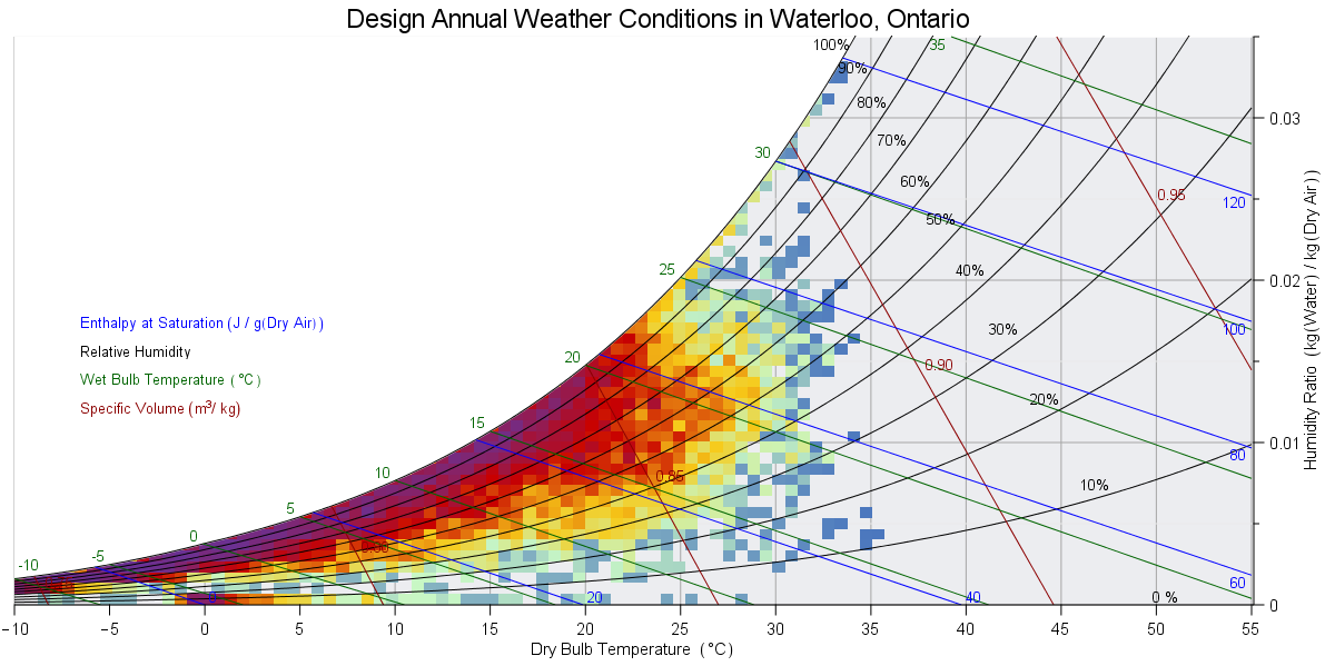
Figure 5: Psychrometric Chart with Annual Weather Conditions
Complex data often has to be mathematically analyzed or transformed before it can be visualized in a meaningful way. Here, we introduce a selection of the analysis tools offered by Maple.
Scattered data often needs to be interpolated onto a regular grid before visualization - this is especially significant for geographical or meteorological data. Maple offered several methods for interpolating scattered data. This functionality was used to generate the smoothly shaded temperature map in Figure 6 (Maple's mapping tools were used to generate the background map).
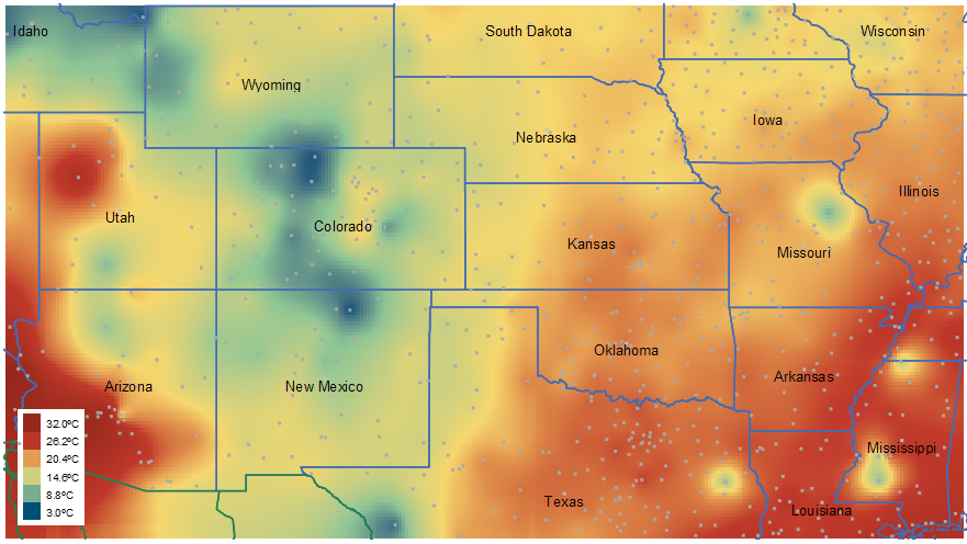
Figure 6: Smoothly Shaded Temperature Map
Many natural phenomena are analyzed in the frequency domain - for example, sound or vibration data. This is a field known as signal processing - a core component of Maple's technical analysis tools.
Consider, for example, Figure 7 and Figure 8. Here, Maple was used to generate a spectrogram and periodogram of a violin note.
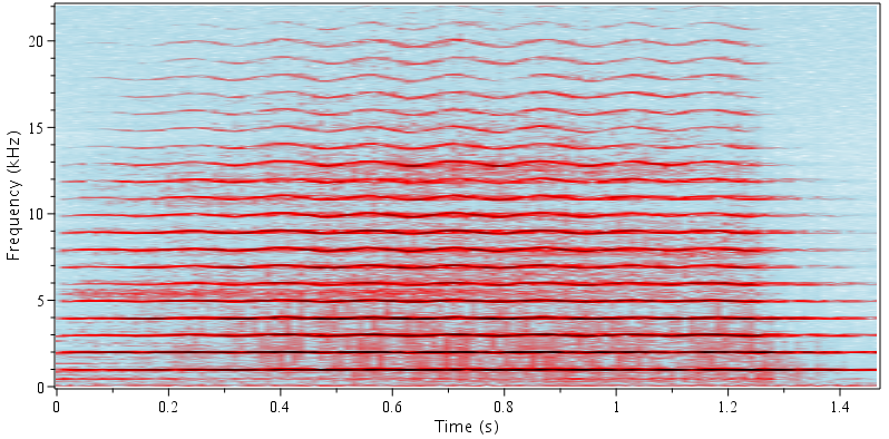
Figure 7: Spectrogram of a Violin Note
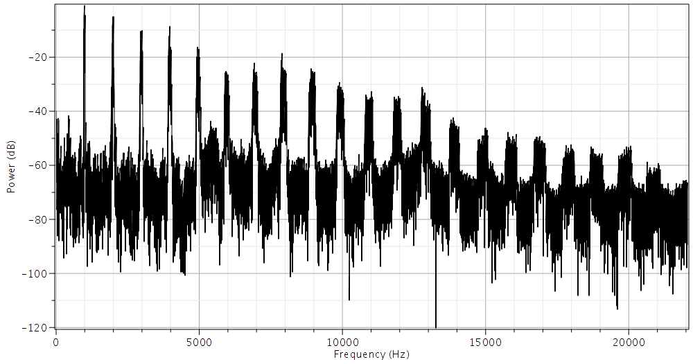
Figure 8: Periodogram of a Violin Note
Maple has tools that allow you to apply computational geometry techniques to points, and clouds of points. The features include Voronoi diagrams, polygon triangulation and convex hulls. Figure 9, for example, illustrates a Voronoi diagram of airports in the United States.
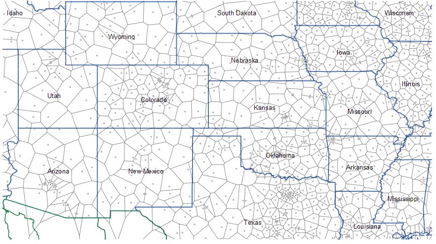
Figure 9: Voronoi Diagram of Airports in the United States
Visualization is a cornerstone of statistics and data analysis and Maple offers a fully featured suite of tools in this field. Figure 9 displays a histogram of significant wave heights, overlaid with a curve describing a Weilbil distribution fit by maximum likelihood estimation. The wave height data is recorded by an internet-connected buoy and read directly into Maple. When requested, Maple will download the latest data and update the histogram.
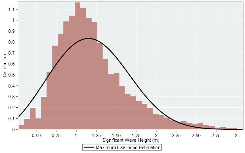
Figure 10: Histogram of Significant Wave Heights
High-speed numerical performance is critical when transforming large data sets into a form suitable for visualization. This is particularly important when generating images of fractals. Here, Maple benefits from automatic multithreading of many routines and a parallel programming language.
These tools were employed to generate the Mandelbrot set in Figure 11 and Quaternion fractal in Figure 12.
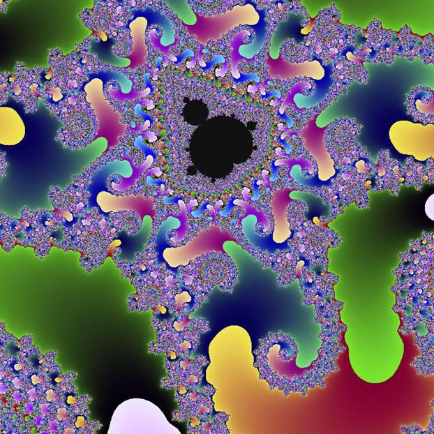
Figure 11: Mandelbrot Set
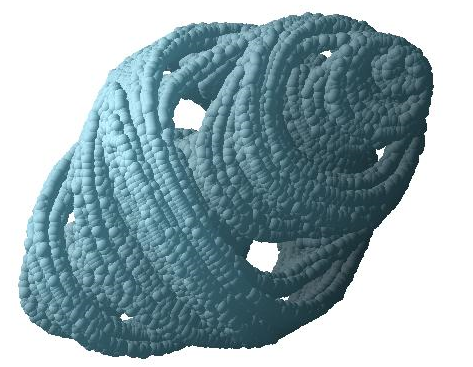
Figure 12: Quaternion Fractal
Maple will generate plots, charts and other visualizations from data. The data can be
Figure 13, for example, shows a Rankine Cycle using water as the working fluid.
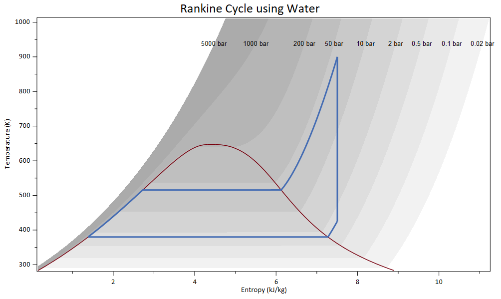
Figure 13: Rankine Cycle
Map visualization tools and a geographical database in Maple let you explore and understand world data in a highly visual way. Maple features tools for generating and customizing maps. You can label points on your map, draw paths that indicate distance between points, experiment with map projections and develop visualizations where color is used to convey the magnitude of data. Maps can also be used with Maple's broad ecosystem of technical analysis tools. Figure 14, displays a Maple application which downloads live earthquake data from online, and plots the location and magnitude on a world map. If you move the mouse over the points in the visualization, an annotation gives the location and the magnitude of an earthquake.
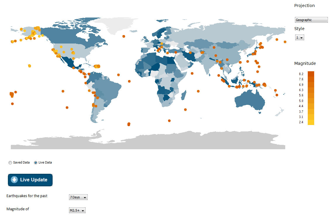
Figure 14: Live Earthquake Data
In Maple, you can add dynamic plot annotations that will appear when you hover over specific points or curves, so you can convey even more information in your graphs. You can display coordinate values, provide an array of annotations and more. Additionally, contour plots automatically display contour values when you hover over a contour line. Text can be placed on a visualization at a precise location to help facilitate further communication. This feature was used to place operating conditions on the process flowchart in Figure 15. Text can also be rotated and manipulated so that the axis numbers, titles and other labels are aligned with the appropriate gridlines. Plot annotations help you provide a richer visualization experience and present a deep layer of information in your plots.
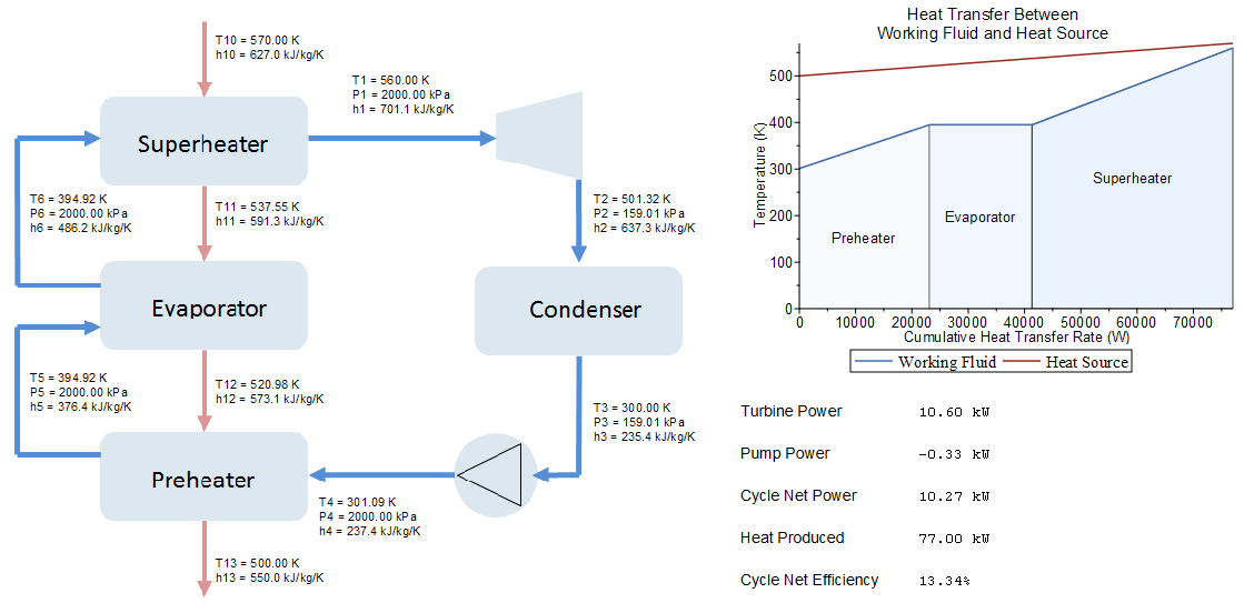
Figure 15: Organic Rankine Cycle
Visualization is a powerful tool for gaining insight into any modeling, simulation or analysis work. When you sculpt an engaging technical visualization, you compel your audience to learn and understand more. Maple helps you analyze your data, generate and customize plots and diagrams, and give you precise control over aesthetics, visual cues and layout. Maple's flexible and intuitive visualization tools are indispensable for creating compelling and sophisticated results.