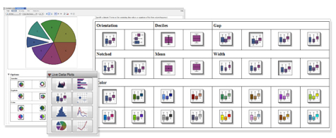
Live Data Plots help with insight, understanding, and publication of your data, all at the click of a button. These plots make it easy to present your data in a form that is visually appealing and conveys meaning. Using Live Data Plots, you can quickly generate and modify:
|
|
|
You can interactively change data, colors, perspective, gridlines, and other options, and instantly see the results.
Live Data Plots Palette
The Live Data Plot palette makes it easy to create and customize statistical plots, including area charts, histograms, pie charts, and scatter plots.
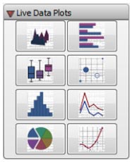
From the Live Data Plots palette, simply click a plot type to insert this palette item into your document.
Easy-to-use Task Templates
Clicking on any of the items in the Live Data Plots palettes inserts a task template that lets you create a customized statistical plot. You simply replace the placeholder with your own dataset, and then click on the option buttons until are are satisfied with the results. Both the plot and the plotting command are displayed, and either can be copied into other parts of your document, so you can easily include the final result in your report or programmatically generate plots with the same options as part of an application.
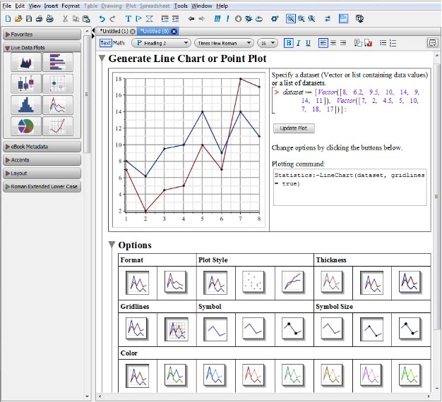
Change Options with a Click of the Mouse
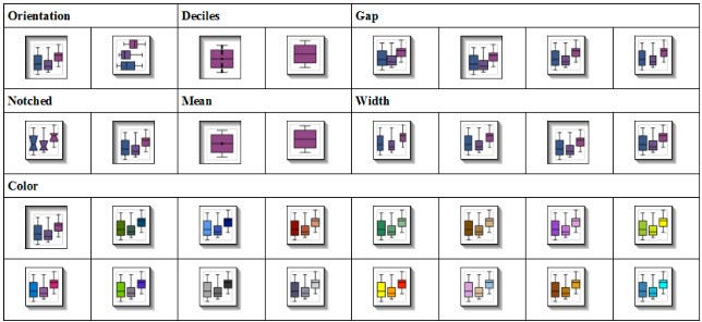
Each task template provides a table of options relevant to the plot. Change the color or plot style by simply clicking on the icon for that option. Keep experimenting until you have exactly the look you want.
Create a Variety of Plots Easily and Quickly
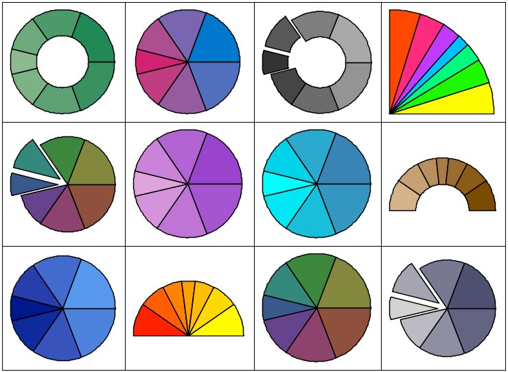
These task templates allow you to generate statistical plots quickly and experiment with different plot options easily. For example, here are just some of the ways you can present data as a pie chart.
